

sparc collaborated with the IIT MarCom Team for six years to complete a wide range of communication initiatives within a strong brand while developing new ways to extend the brand.
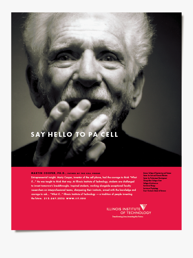
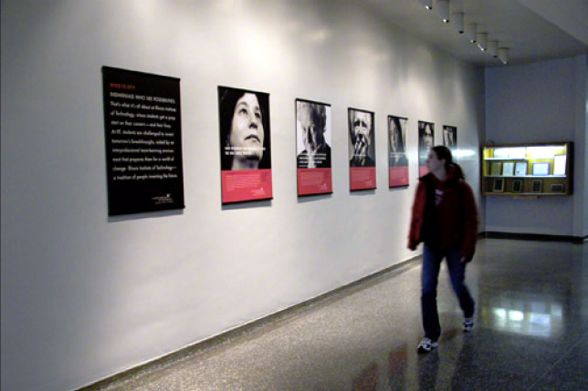
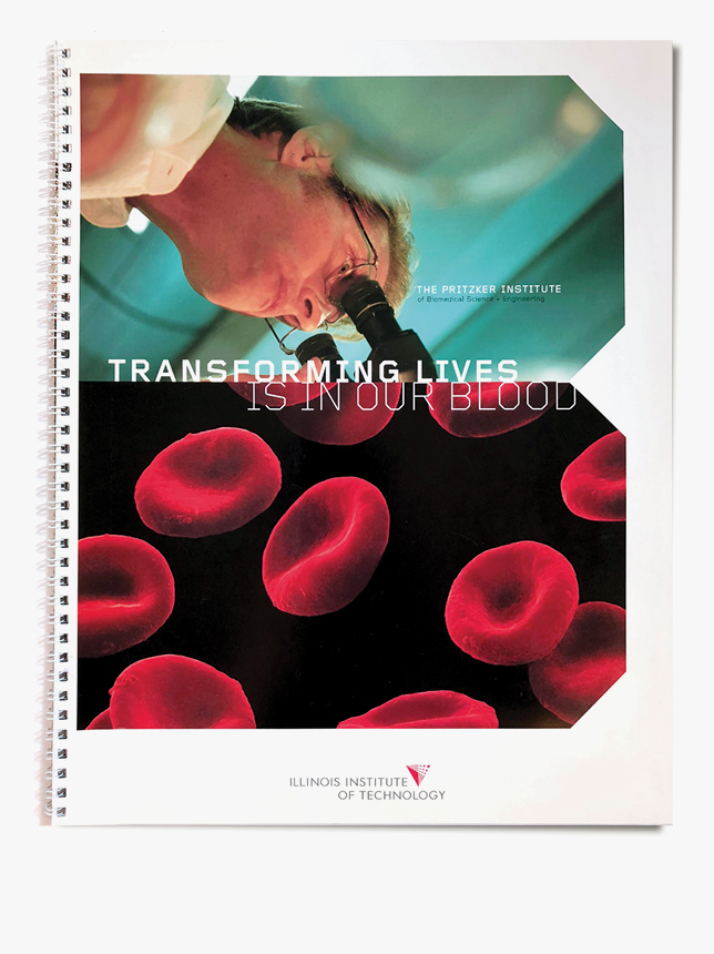
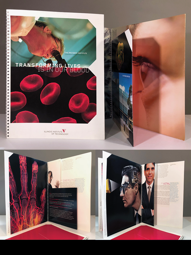
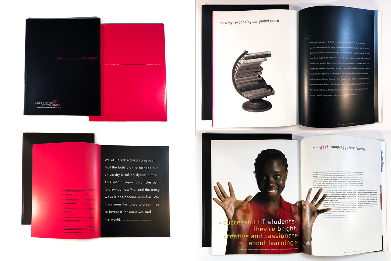
With the overarching goal of attaining widespread recognition as a first-tier college, the Illinois Institute of Technology (IIT) forged this brand system and standards utilizing an always dependable and visually strong color combination of black, red and white. With its use of the classic geometric Futura font family, the brand pays homage to the campus' famous Mies van Der Rohe modernist building, Crown Hall, as well as the strong reputation of IIT’s highly respected Engineering and Architecture schools. The crossing pathways are a nod to the institution’s commitment to collaboration and innovation, while it’s delta shape hints at the importance of progress and change always present in its fields of specialty.
Remaining true to its commitment to forward thinking, IIT has since retired this brand system in favor of an updated version.
SERVICES : BRAND STEWARDSHIP, CONTENT DEVELOPMENT, CREATIVE DIRECTION, ART DIRECTION, EXTERIOR + INTERIOR SIGNAGE, PRINT + DIGITAL COLLATERAL & ADVERTISING